


Everything Widgets
JustNewDesigns
I spent time with Everything Widgets as a personalization app, and my first impression was clear: this is aimed at people who want their home screen to feel deliberately designed rather than merely functional. Developed by JustNewDesigns, it focuses on a Nothing-inspired visual language, with a large collection of widgets built around restrained monochrome styling, clean spacing, and a technical-looking character. I found it most appealing when I treated the home screen as part of the phone’s overall identity instead of just a place for shortcuts.
The price is $1.09, which puts it in the easy-to-try range for anyone already interested in this particular aesthetic. It is rated for Everyone, runs on Android 12 or later, and the current version is 2.1.014. The app has reached over 100 thousand installs and holds a 4.6 average from around 10 thousand ratings, so it is not an obscure experiment with only a handful of users. Still, popularity alone does not make a widget pack right for every phone. The real question is whether you like a controlled, Nothing-like look enough to accept some setup work and visual limitations.
How Everything Widgets feels in everyday use
A strong visual idea, not just a pile of shortcuts
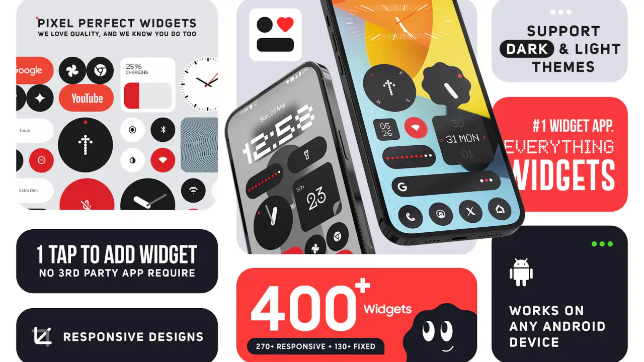
The collection is built around the idea of turning ordinary information into part of the design. Instead of treating a clock, date, battery indicator, or other home-screen element as an isolated tool, the widgets are meant to sit together as a visual system. That distinction matters. Many widget apps offer attractive individual pieces, but their styles can clash when placed side by side. Here, the appeal comes from keeping the same restrained tone across the screen.
I like that this approach gives a phone a recognizable personality without forcing a loud wallpaper or a complicated launcher setup. A dark background and a few carefully selected widgets can make the screen look calm and intentional. On a lighter background, the same style can feel more editorial and graphic. The result depends heavily on spacing, alignment, and the rest of the icon theme, so this is not a one-tap transformation in the practical sense.
The store summary describes more than 400 crafted widgets, and that breadth is useful because it gives you room to build different layouts rather than repeating one design everywhere. The important point is not simply the size of the collection. It is the possibility of choosing a small group that works together. I got better results by thinking in terms of a layout first and browsing for pieces that fit it, rather than adding every widget that looked interesting.
Related News

Why WhatsApp Messenger Still Makes Everyday Communication Feel Easy

Jurassic World: The Game Is the Better Dino Tycoon for Strategic Players

Threads in Real Life: Who Should Join, Lurk, or Leave

How SHEIN Turned Shopping Into an Endless Content Feed

How to Make Fortnite Feel Smarter on Mobile

Should You Switch to Microsoft Outlook on Mobile?
What to expect from speed when setting up a home screen
Widget apps are judged differently from ordinary utilities. You do not usually open them for long sessions; you browse, configure, place an item, and then let the operating system display it. In that context, the perceived speed of Everything Widgets comes less from constant interaction and more from how quickly you can move from the catalog to a usable arrangement.
My practical advice is to avoid rebuilding the entire home screen in one burst. Start with the main screen, place one large element, and then add smaller pieces around it. This makes it easier to notice whether the composition feels balanced and reduces the frustration of repeatedly removing items that looked better in the preview than they do alongside your icons. The app is most enjoyable when treated as a design tool rather than a gallery to rush through.
There is also a useful trade-off between visual detail and instant readability. Some designs look excellent when the screen is viewed as a whole but are less immediately legible than a standard system widget. If you need to glance at information while walking or driving, a simpler widget may serve you better. Everything Widgets rewards a slower, more deliberate glance, particularly when several decorative elements compete for attention.
Gallery
Heavy-use moments: where the collection can become demanding
The heaviest use is likely to happen during customization, not normal daily viewing. Browsing a large catalog, comparing styles, resizing elements, and repeatedly rearranging a launcher can make the process feel more involved than installing a conventional clock or weather widget. That is not necessarily a flaw; the breadth is part of the value. But it means the app is better suited to someone who enjoys refining a layout than to someone who wants a finished screen immediately.
A practical workflow is to create a temporary page for experimentation. I would place candidate widgets there, compare their visual weight, and only move the final selection to the main page. This avoids the common problem of turning a clean home screen into a crowded test board. It also reveals an important strength: the collection can support both a minimal arrangement and a denser information layout, provided you are willing to edit rather than accept the first combination.
Resource demands are harder to judge from appearance alone, because a widget’s ongoing behavior is managed partly by Android and by the launcher. I would not assume that a screen filled with widgets is free of cost simply because the design is visually minimal. More active elements can create more background work than a single static clock. For that reason, I prefer using a few meaningful widgets and removing anything I stop checking. That is good home-screen housekeeping regardless of the device.
One non-obvious trade-off is that a highly coordinated layout can make you dependent on several elements working together. If you remove one widget later, the empty space may be more noticeable than it would be with unrelated system components. Before building a full composition, I recommend leaving enough flexible space for future changes. A design that looks perfect only when every piece remains in place can become inconvenient after a launcher update or a change in your routine.
Stability and recovery after changes
For a widget pack, reliability means more than whether the app opens. It also means whether the home screen remains understandable after resizing, rotating the device, switching launchers, or changing the wallpaper. These situations are where a carefully designed layout can need attention again. I would save a mental note of the widget sizes and placement rather than assuming the arrangement will always survive every system change exactly as it was.
Recovery is relatively straightforward when you keep the process organized. If a widget disappears or no longer fits, return to the app, choose the same design again, and rebuild the affected area instead of changing the entire page. Taking a screenshot of a finished layout is another simple but useful precaution. It gives you a visual reference if you need to restore the screen later, especially when several similarly styled options are available.
The monochrome style helps in one respect: small inconsistencies are often less visually disruptive than they would be in a colorful collection. On the other hand, the restrained palette can make subtle differences in size and alignment more obvious. A widget that is slightly too wide or too low may stand out because there are fewer colors to distract the eye. I found that careful grid alignment mattered more here than it does with casual, mixed-style widgets.
I would also approach updates with a little patience. The current version is 2.1.014, and any widget app can evolve as Android and launcher behavior change. After an update, it is sensible to check the main page and confirm that the elements you rely on still look correct. This is not a reason to avoid the app; it is simply the normal maintenance that comes with customizing a system surface rather than installing a self-contained tool.
Android limitations that shape the experience
The minimum requirement is Android 12, so owners of older phones should not plan around this app. For compatible devices, the larger limitation is not the operating system version alone but the launcher. Android launchers differ in how they handle widget grids, padding, resizing, and page layouts. A widget that fits neatly on one launcher may need a different size or position on another.
This is why I would not judge the collection solely from screenshots. The same design can feel spacious on one display and cramped on another, particularly when the phone uses a narrow grid or large system text. Before buying, think about the screen you actually use: resolution, icon spacing, wallpaper contrast, and whether your launcher allows fine control over widget placement. The app can provide the visual ingredients, but your device determines how much control you have over the final arrangement.
Android 12 or later also means the experience belongs to a relatively modern device environment, but modern does not automatically mean identical. Manufacturer software may add its own home-screen rules, and some users may prefer the default launcher precisely because it is predictable. If you dislike adjusting grids or managing a custom layout, a standard system widget will probably be less work and may remain easier to restore after a reset.
Another device constraint is readability. Nothing-inspired graphics often use thin lines, compact labels, and strong contrast, but the practical result still depends on eyesight and display settings. If you use enlarged text, accessibility scaling, or a very busy wallpaper, some designs may lose their intended balance. I recommend testing one or two widgets before committing to a full screen, especially if quick readability is more important to you than the visual theme.
Useful scenarios beyond decoration
A realistic everyday use case is a workday home screen with one prominent time element, a date-focused piece, and a small amount of supporting information. I would place that on the first page and keep messaging, calendar, or task shortcuts nearby. The advantage is psychological as much as practical: the screen feels less cluttered, which can make it easier to focus on the next action instead of scanning a wall of colorful badges.
For a travel day, a second page could use a denser arrangement so the information you check repeatedly stays together. The collection’s consistent style makes that page feel connected to the main screen even if it contains more elements. I would avoid filling every available space, though. A crowded layout may look impressive during setup but becomes tiring when you are trying to find an app quickly in a hurry.
It can also work well for someone who has moved to a Nothing phone or simply likes that design language on another Android device. The experience is not the same as owning hardware designed around that visual identity, and I would not buy it expecting a complete system transformation. What it does offer is a way to carry a related mood into the home screen without replacing the entire phone interface.
On the other hand, I would skip it if you prefer colorful, information-heavy widgets, automatic personalization, or a home screen that changes frequently. The value here comes from choosing and arranging a coherent visual set. Users who want advanced live dashboards, broad customization across every interface element, or a highly playful theme may find a general-purpose launcher or a more utility-focused widget platform more suitable.
How it compares with ordinary alternatives
The usual alternative is the collection of widgets already included with Android or supplied by individual apps. Those options are often better for straightforward information: a familiar calendar, a clearly labeled weather panel, or a system battery display. They tend to prioritize function and consistency with the operating system. Everything Widgets competes on atmosphere and cohesion rather than replacing every default tool.
Another alternative is a general widget builder. A builder may offer deeper control over colors, data sources, formulas, and layout logic, but that freedom can require more time and experimentation. Everything Widgets is more focused: you start with a designed visual direction instead of constructing every detail yourself. That makes it a better choice for someone who wants a polished starting point, while a builder is stronger for users who want to invent a completely personal interface.
Icon packs and launchers solve a different part of the problem. They can change app symbols, grids, gestures, and navigation behavior, whereas this app concentrates on the widgets occupying the home screen. Combining them can produce a more complete transformation, but it also introduces more opportunities for mismatched spacing and extra setup. I would begin with the widgets alone, then decide whether the rest of the interface actually needs changing.
Who should install it, and who should think twice?
I would recommend Everything Widgets to Android users who enjoy calm, monochrome design and are willing to spend time arranging a screen. It is particularly convincing for people who want a Nothing-inspired look without turning the phone into a heavily modified project. The low purchase price also makes experimentation relatively painless, assuming your device meets the Android requirement and your launcher gives you enough placement control.
I would be more cautious if you measure personalization by the number of colors, animated effects, or deep data integrations available. This app’s identity is its restraint. That can make a screen feel elegant, but it can also make the collection seem narrow if your taste changes often. Likewise, anyone who wants a widget to communicate information instantly should compare the visual design against the clarity of the default Android equivalent before replacing it.
Before settling on a final layout, I suggest three checks. First, view it in both light and dark conditions, because contrast can change the usefulness of thin or compact elements. Second, remove one widget and see whether the page still works; this tests whether the design is flexible or overly dependent on a perfect arrangement. Third, use the screen for a normal day instead of judging it only while customizing. A beautiful layout that slows down routine tasks is not a successful layout for you.
My performance verdict after living with the design
Everything Widgets is best understood as a focused visual toolkit rather than a universal home-screen replacement. Its large collection gives the Nothing-inspired style enough variety to support different layouts, while the consistent design language makes it easier to create a screen that feels unified. I appreciate that it can make an ordinary Android setup feel considered without requiring a complete launcher overhaul.
The compromises are equally clear. Setup takes more thought than using the default widgets, the final result depends on your launcher and display, and a restrained design may sacrifice some instant readability for visual character. Heavy widget use also deserves moderation, not because the app’s appearance proves anything about resource consumption, but because a crowded home screen is harder to maintain and less useful in real life.
My recommendation is simple: buy it if you already like the Nothing-inspired look and want carefully matched widgets that you can shape around your routine. Start small, keep a backup screenshot of the finished page, and judge the layout after several ordinary days. If you prefer maximum information, bright customization, or zero setup, the standard Android widgets or a more flexible builder will probably serve you better. For the right user, though, the real strength is the balance between a distinctive visual identity and manageable personalization.
At $1.09, I see it as a modest purchase for people who care about the details of their home screen. JustNewDesigns has made a collection that is specific enough to feel intentional, yet broad enough to avoid looking like a single repeated template. I would not call it essential, but I would recommend it to a friend who wants a cleaner, more graphic Android setup and understands that the best result comes from thoughtful selection rather than filling every empty space.
FAQs for Everything Widgets
What is Everything Widgets, and what can I use it for?
Everything Widgets is a customizable widget app designed to place useful information and shortcuts directly on your Android or iOS home screen. Depending on the available version and widget support on your device, you can use it to view items such as weather, time, calendar details, notes, reminders, battery information, or app shortcuts without opening each application individually. It is mainly aimed at users who want a more practical and personalized home-screen experience.
Is Everything Widgets compatible with my Android or iPhone?
Compatibility depends on the operating system version, device model, and the specific features supported by your platform. Android generally offers more flexibility for resizing, positioning, and customizing widgets, while iPhone widgets are subject to Apple’s home-screen and lock-screen restrictions. Before downloading, check the app-store listing for the required Android or iOS version, supported devices, and whether certain widgets or functions require a newer operating-system release.
Does Everything Widgets require special permissions or access to personal data?
Some widgets may need permissions to display accurate information. For example, a weather widget can require location access, a calendar widget may need access to events, and reminder or notification features may request permission to send alerts. These permissions are not necessarily required for every widget. During setup, review each request carefully and allow only the access needed for the features you plan to use. You can usually change permissions later in your device settings.
Can I customize the appearance and layout of Everything Widgets?
Customization is one of the main reasons to use a widget application such as Everything Widgets. Available options may include choosing different widget styles, changing colors, selecting light or dark themes, adjusting transparency, resizing widgets, and placing them on the preferred home-screen page. However, the exact controls can vary by widget type and operating system. Some advanced designs, themes, or personalization tools may also be limited to premium users or require an in-app purchase.
Is Everything Widgets free to download, and are there advertisements or in-app purchases?
The app may be available as a free download, but the final cost structure depends on the version listed in the Google Play Store or Apple App Store. Free versions can include advertisements, optional subscriptions, or one-time purchases for additional widget packs, premium designs, advanced customization, or an ad-free experience. Check the store page before installing to confirm current pricing, trial conditions, recurring billing details, and whether the most useful features are included without payment.
Pros
- Wide variety of useful widgets for different everyday needs.
- Quick access to information without opening multiple apps.
- Flexible customization helps match your home-screen layout.
- Clean interface makes browsing and adding widgets straightforward.
- Helpful for personalizing Android devices with practical shortcuts.
Cons
- Some widgets may require extra permissions to work properly.
- The large selection can make finding a specific widget time-consuming.
- Certain designs may not blend well with every launcher or theme.
- Widget performance can vary depending on the device and Android version.
- Frequent home-screen widgets may increase battery and memory usage.


